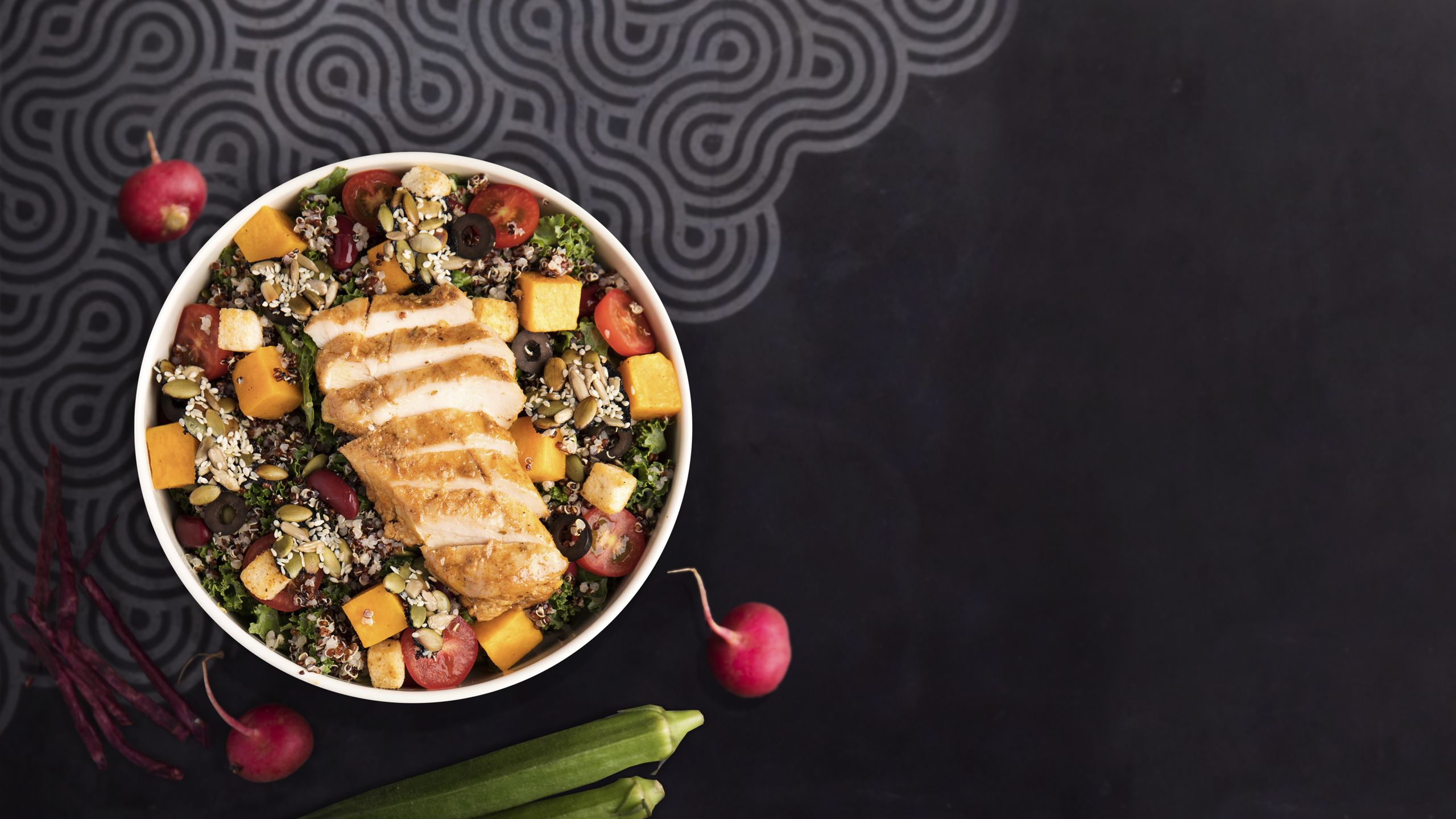
What's on your plate?

Around the world, people are ready for their next delicious meal.
What's yours going to be?
From simple traditional dishes to elaborate restaurant fare, plates are currently being loaded with savoury, sweet, hot, cold, crunchy, smooth and colourful food.
Never before have we had so many options to not only satisfy hunger pangs, but to indulge ourselves in sensory foodie pleasures with tastes both familiar and new.
Globally, our palates are widening with easier access to ingredients and influences from around the world.
So, what's your next meal going to be?
Fresh salad & fetta?

Pizza?

Vegetables?

Burger?

Cereal?

Soup?

WHAT YOU EAT!


SHOULD I BE
CONCERNED?
LET'S LOOK AT THE
LIVES
TAKEN TO FEED
ONE HUMAN BEING

CONCERNED YET?
GLIMPSE OF THE WORLD MEAT
CONSUMPTION

TOO GREEN?
GLIMPSE OF AMERICA'S MEAT
CONSUMPTION

SOLUTION??

What does Veganism and being Vegan mean?
Change to plant-based products (mostly). Finding the same or more nutrients from a plant than having to slaughter innocent animals for it.
It also means you are more aware of your surroundings and care for them! :)

HEAD TO
YOUR NEAREST
VEGAN RESTRAUNT
TO FILL
YOUR BOWL!


Target Audience:
All the public.
Purpose/Call to Action:
Engage them to explore Vegan food and try out restraunts that serve Vegan food.
User Research Feedback / Proposed Changes:
Interviewee 1:
They expected that the flow is in such a way that the user is convinced to explore Vegan products, probably try a few dishes in the restaurants that offer them.
Have data that represent that overconsumption of meat, or just how meat consumption is bad for one’s health. In general, how meat consumption affects one’s health versus having plant-based food.
What they liked:
They like the geo – map. How it highlighted the consumption of meat throughout the world and then focus on it for the US states. (Well received, just as was intended for the audience to be! 😊)
They also thought maybe the impact of the meat consumption be given to the environment and the harm caused to animals.
They also felt that the interface was easy to explore and the content too.
Interviewee 2:
The interviewee expected a clearer call to action. They said it would help to deliver the message better to the audience (which is the public) and feel more indulged in the cause.
They felt that the locations on the map, which are already interactive have a link to the restaurant’s website itself. So that the user can get to see those restaurants just at a click.
They wanted to have a better understanding of the bad side of eating meat and thus what the benefits of opting for a Vegan diet be.
The interviewee was confused with the labeling names used in the pie chart. They felt, probably using a different dataset, or just changing the labels of the pie-chart.
Interviewee 3:
The interviewee felt that it might be a better option to display restraint chains that serve Vegan options. They felt that if these big chains are mentioned, it might be better for people to try them at those places as they might have been already explored by them. And these chains are available widely across the city. Thus, the interviewee felt it would be a good first step for people to explore. They suggested there are chains like Chipotle which offer Vegan options and are available almost everywhere!
They also felt that knowing when a restraint introduced Vegan food option is not necessary for individuals to know. They might not be so inclined to know so, rather focus on having a stronger call to action which is more explicit.
Next Steps/Probable Changes:
Definetly a more prominant and distinct call to action.
Work on the Geographic maps to make them more user friendly.
Add a section to highlight benefits of plant-based diet.
Need to research if I have to link the websites to the Geolocations of the restaurants.
Probably engage in another round of interviews to see if the information is coherent.