What good is tracking data if you can't compare it?


To begin, I needed to determine what data I had that was both specific to me, but also available for the entire year.
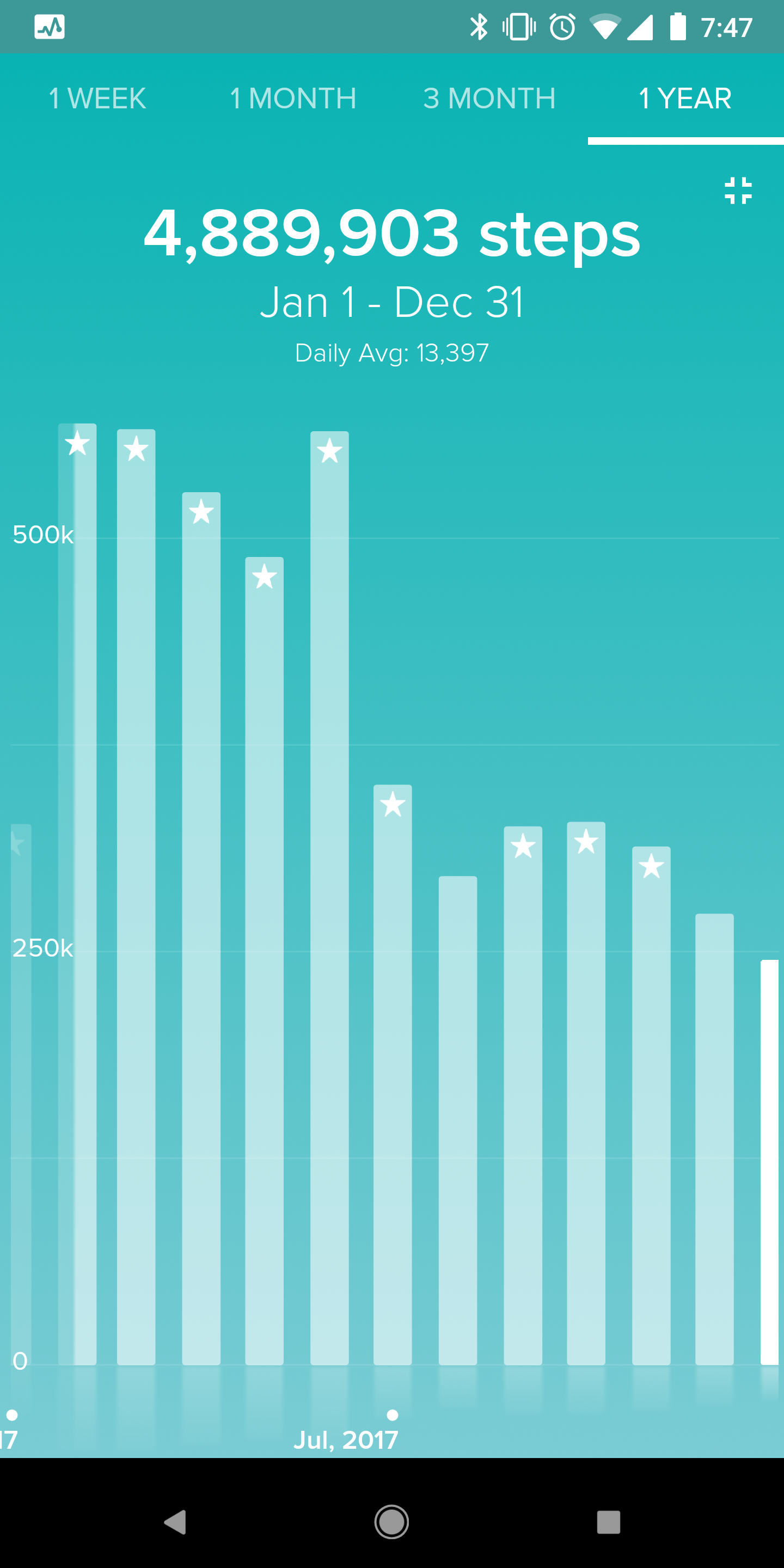
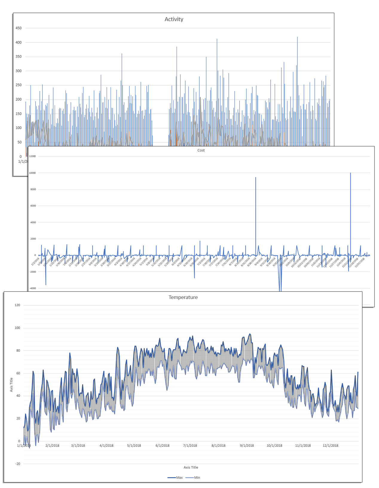
Since 2015, I have been wearing a FitBit activity tracker. This data is both easy to access and comprehensive for each day that I remember to wear it/have it charged. For 2018, there was only a handful of days where I did not have data to use as a result of one tracker dying and me waiting for a replacement to arrive via the FitBit warranty program.
Trending out daily activity is a good starting point for understanding what I was doing each day and how much time was likely spent at my desk vs being active in my surroundings. It is my initial hypothesis that on days when I am more sedentary and "tied to my desk" for work or school, I have a higher chance of opening a new tab to buy something or try and distract myself from the task at hand.
Other data that is easily attained and universal for 2018 is basic weather data. High and low temperatures as well as precipitation amounts give a great secondary data point to clarify days with high or low activity. If I was inactive in FitBit and the weather was nice and dry, then there was no excuse for me to not go outside instead of sit at my desk. It is the number of those days that might hold the key to spotting trends in my buying habits.
The final piece to the data puzzle is the actual spending data for the year. I have been almost completely void of cash since 2012 and as a result nearly every purchase I make is tracked either through my banking app or my main credit card. For both, a full transaction list is easily downloaded with dates, amounts, and vendors clearly stated.
While the data is not public in nature, it does represent data that could be easily collected by individuals looking to build similar insights into their own lives. As people become increasingly more connected to their smart devices, this level of personal exploration may be vital to maintaining good balance and understanding of our own actions - especially as apps, devices, and websites continue to make it easier for us to blindly interact and get lost in hours of potentially useless activities.
Initial Study of Data
Looking at Activity vs Spending vs Temperature

Losing the Forrest in the Trees
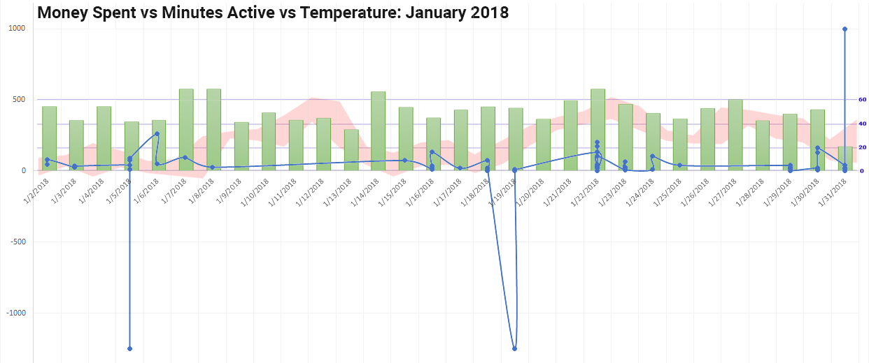
Looking at data for an entire year can be daunting, but the bigger problem is that it can also be difficult to see patterns or important trends. With my first set of quick data sketches, I tried to see if any initial overlaps or trends were visible, but instead, just found that the data was too busy. Spikes for temperature, spending, and activity all had equal impact and as such, no impact at all.
Without cleaning up the data and narrowing my focus, there didn't seem to be anything useful to start from. I talked showed this initial graphs to a few co-workers and asked if anything stood out to them. Two responses were specifically helpful:
- Why does the graph you say is for tracking spending, have so many negative spikes? I explained that the data was pulled from my bank and credit card, and the negative spikes were when I got got paid and when I paid off the balance/bill each month.
- The spending/cost graph and the activity graph don't seem to follow the bell curve of the temperature graph - would it work better if you compared month to month? This idea was a great starting off point for further discovery.
This basic review pointed me toward more specific and individual data comparisons. Instead of trying to identify massive trends over the course of a full year, I needed to look more closely for day to day trends. I also needed to re-evaluate the data I was looking at to make sense with what I was trying to find. Recurring bills and bi-weekly payroll were not affected by activity or weather, or any other factor - they are the constant that I cannot change.
What should personal data look like?

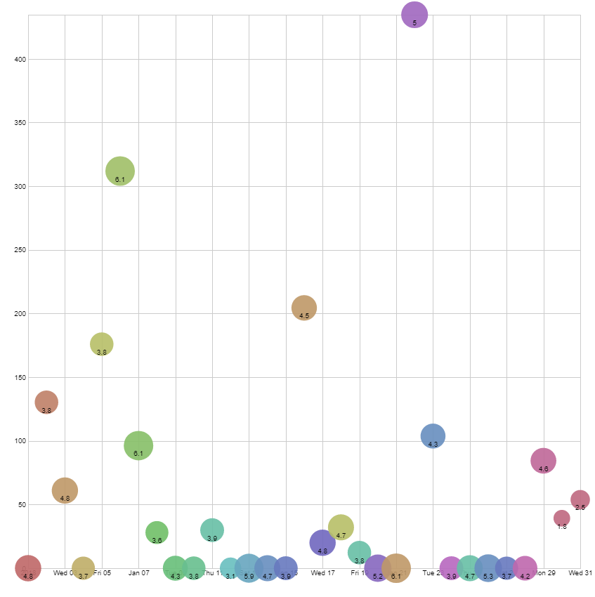
My first attempt to visualize data came in using a bubble plot. The X-axis was dates from January 1 - January 31, 2018. This made the most sense as people are used to seeing time portrayed from left to right. The Y-axis was money spent for that day. Finally the bubbles were scaled based on the amount of activity I tracked that day.
My first attempt to visualize data came in using a bubble plot. The X-axis was dates from January 1 - January 31, 2018. This made the most sense as people are used to seeing time portrayed from left to right. The Y-axis was money spent for that day. Finally the bubbles were scaled based on the amount of activity I tracked that day.
Taking the feedback from the first trial, I flipped the meaning of the y-axis and the size of each bubble. Now the activity tracked determined the height of the bubble while the money spent determined the size of each bubble. The date remained along the x-axis.
Taking the feedback from the first trial, I flipped the meaning of the y-axis and the size of each bubble. Now the activity tracked determined the height of the bubble while the money spent determined the size of each bubble. The date remained along the x-axis.
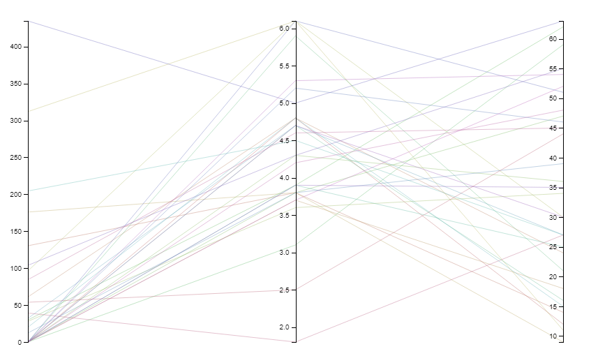
As essentially an A/B test of people on the data visualizations I was working on, I completely scrapped the traditional x/y axis and went for a more linear graphic. Using Parallel Coordinates, I was able to sort each element of data from low to high. Instead of interpretation of scale, each data set was explicitly labeled and connected to its corresponding data (Money spend on the left, Activity tracked in the middle, and max temperature on the right).
As essentially an A/B test of people on the data visualizations I was working on, I completely scrapped the traditional x/y axis and went for a more linear graphic. Using Parallel Coordinates, I was able to sort each element of data from low to high. Instead of interpretation of scale, each data set was explicitly labeled and connected to its corresponding data (Money spend on the left, Activity tracked in the middle, and max temperature on the right).
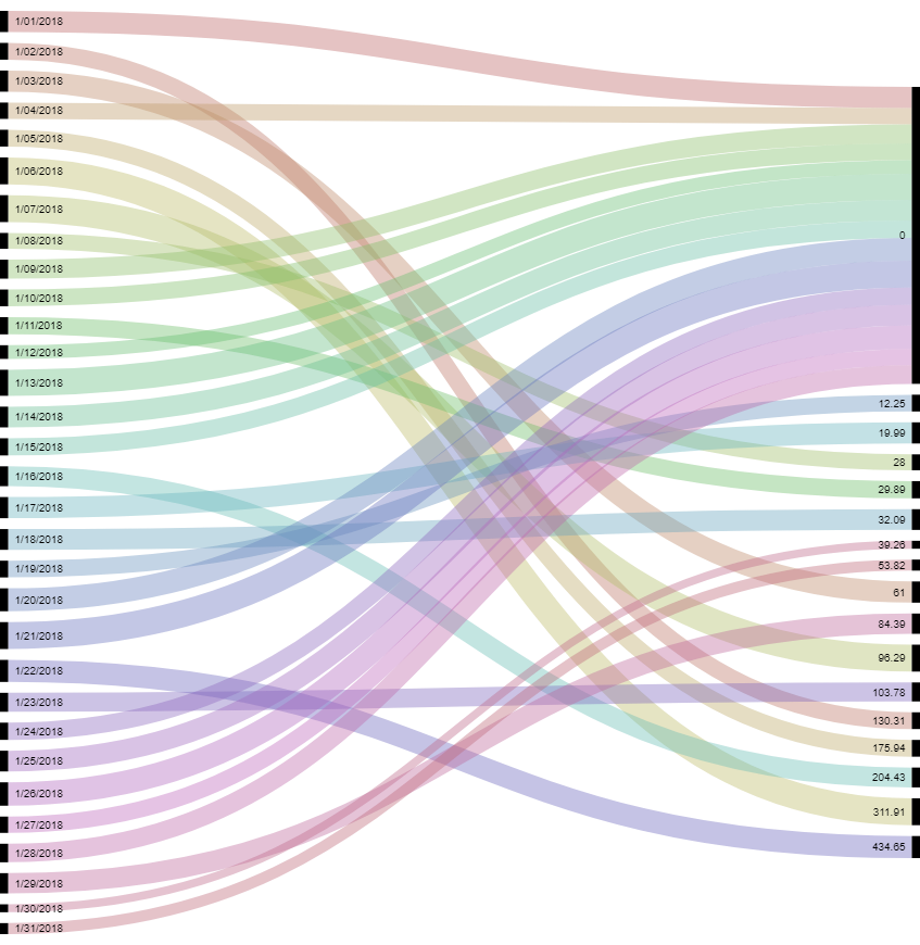
Taking the positive parts of the parallel coordinates, I began playing with the Alluvial Diagrams. At the same time, I brought back in the dates for each day as there seemed to be some comprehension of the data that was lost when just looking at activity vs money spent with no reference of time. Now Dates went from top to bottom along the left and money spent went up along the right. The connecting path between date and money spent was then scaled based on activity tracked.
Taking the positive parts of the parallel coordinates, I began playing with the Alluvial Diagrams. At the same time, I brought back in the dates for each day as there seemed to be some comprehension of the data that was lost when just looking at activity vs money spent with no reference of time. Now Dates went from top to bottom along the left and money spent went up along the right. The connecting path between date and money spent was then scaled based on activity tracked.
Find the playful side of data
Taking a closer look at personal data tracking apps and bullet journals, I noticed a number of repeating characteristics:
- Colorful graphics
- Each element is tracked in isolation of other data
- Linear (or arc) based graphics to imply progress
- A level of whimsy or almost childish design makes the data more approachable
- Even if data shows something negative, make the viewer feel positive
Armed with these aesthetic goals and the new, more focused view of my data, I began playing around with ways to best connect the three different data sets in a playful, but meaningful way. Specifically, I honed in on Date, Money spent (minus recurring bills), and measured activity. In a few cases I added in max temperature to see if adding in a fourth data point made the information more or less meaningful.
Graphic Attempt #1
While the graph was whimsical and followed a lot of the design elements I was aiming for, feedback was almost completed centered on the question, "Why is activity spent important?" Follow up conversation revealed that because the bubbles all appeared to be roughly the same size, there was little additional information it was adding over a simple bar graph of money spent vs time.
Graphic Attempt #2
This graphic did elicit a lot more feedback and input on both the graphical meaning and the intended data correlation I was trying to make. This data set was also the first time that I was personally able to see that there was at least a small connection between higher amounts of activity and money spent - the complete opposite of my initial hypothesis.
Unfortunately, in asking people to look at the graphic after a very quick rundown of the project, the majority of people said that this type of representation would not be motivating or helpful to them on a daily basis. The sparse amounts of white space, while great because it means they spent less money, makes it hard to grasp the weight of when they do spend money (the large green circle represents $400 in a day, but doesn't jump out as any worse than the smaller purple dots at the beginning of the month representing only $60ish spent).
Specifically one person said they wanted to see the data presented in a way where they could track the progress from day to day or it wouldn't be useful. It appears that the designs of WearOS, FitBit and other smart watches have already become mainstream enough to create expectations for graphical readability.
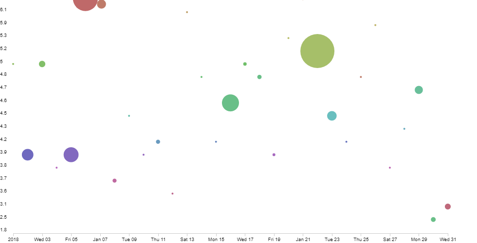
Graphic Attempt #3
This completely different visualization was initially created to see if temperature had any baring on the spending trends. For the most part it did not highlight any specific trends, but the top four spending days did fall within the top 50% of temperatures for January 2018. Additionally, removing the dates from each item allowed the reviewers to concentrate on the data itself, and not try to extrapolate a trend based on the day of the week.
The result was interest, but also a lot of confusion. Specifically, the lines were too thin and hard to track. Additionally, many people noted that this type of visualization would not be helpful for them to get a feel for how they were doing vs the goal, as the "lines seem to go every which way."
I however found a lot of useful information in this graphic. Specifically I noted the number of days where I had spent nothing all seemed to trend to the top days of activity. This again started to point to a trend opposite of my initial hypothesis.
Graphic Attempt #3.5
With this last graphic, I received the most positive feedback, but almost entirely along the lines of "that's pretty, how'd you make it?" It also took more time for the viewer to start to ask questions about the data itself. However, once some basics of the graphic were explained, a lot of feedback was in line with what I had hoped to get from the data visualizations:
- "It appears that you spend money in spurts every few days."
- "Wow, there were a lot of days were you were really good at not spending any money!"
- "This would be interesting to see on my credit card statement."
I finally knew I was going in the right direction with the visuals, and had also started to get a better feel for the data I wanted to display and how.
Monthly Overview through an Alluvial Diagram with dates and money spent as left and right respectively. The width of the bands would be tied to activity recorded, but the coloring would highlight week days vs weekends.
Daily status cards with a simple circular bar chart (similar to Apple Watches) to highlight important information: Money spent, Activity Tracked, and Max Temperature with a color indicating a good or bad day for spending.
The only problem then became designing and creating 365 individual graphics and 12 Alluvial Diagrams. But I will leave that for the final presentation.